
Garros / Visual identity
A clearer identity.
Built on experience.
A distinctive identity for a company providing personnel for furniture assembly and construction.


The challenge
Recognition, on and off the job.
Garros provided personnel for furniture assembly and construction. Its existing logo was difficult to apply consistently and was often confused with other companies.
Make experience part of the identity.
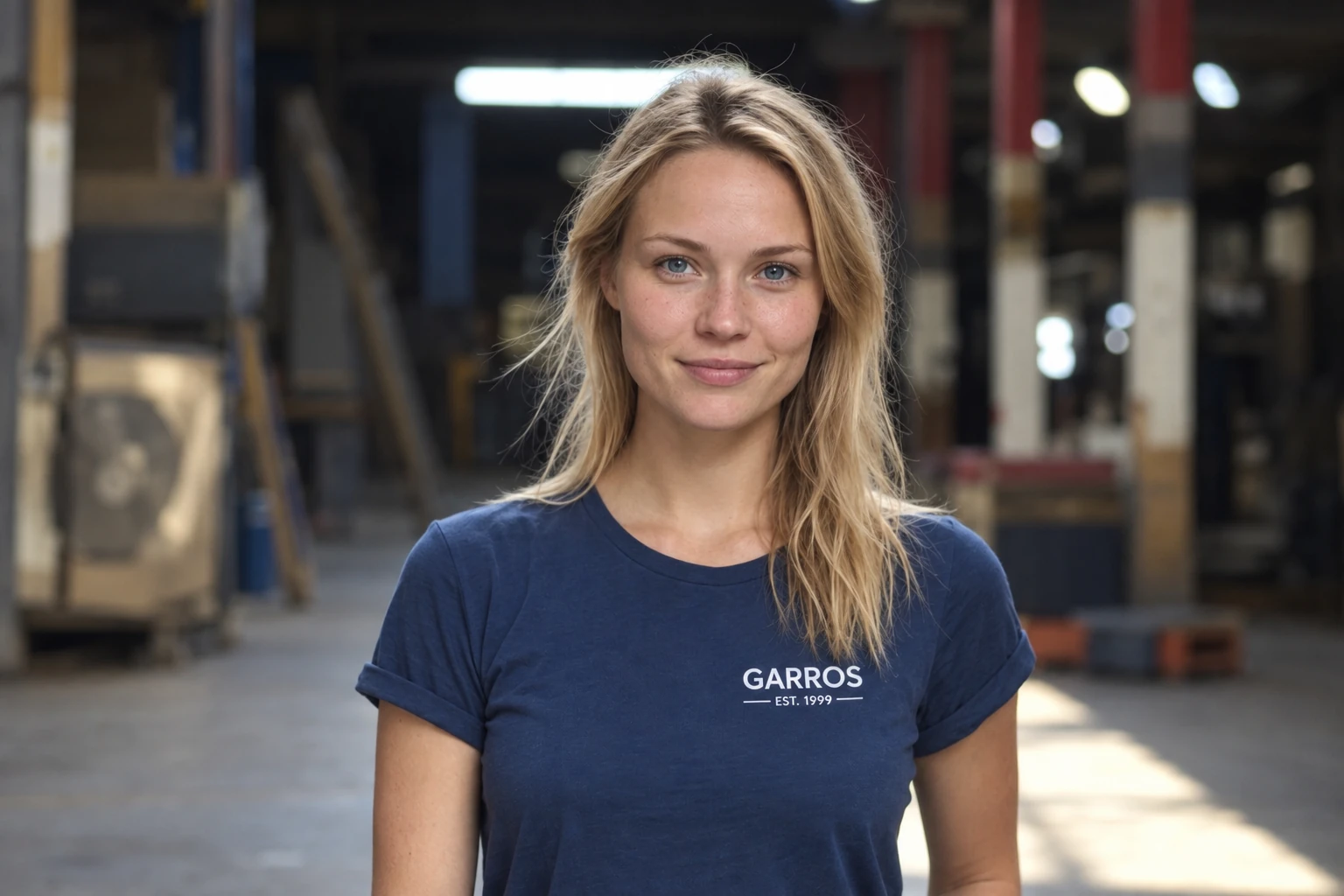
The redesigned logotype brought “Est. 1999” into the design to highlight the company’s long-standing experience. The new colour palette paired a dependable blue with white, with reversed versions for different backgrounds.
The identity was applied to staff clothing, giving the team a consistent presence on the job.
The result
A practical identity with a history.
A recognisable wordmark, a simple blue-and-white palette and a visible connection to 1999 gave Garros a consistent foundation for its everyday applications.